Introducer Portal

A versatile website for brokers to process loan applications.

Duration

6 months

Team

Emma Haines
Ross Morey
Abbie Cookson
Tiffany Lin

Role

User research, User interview, IA, UI, UX

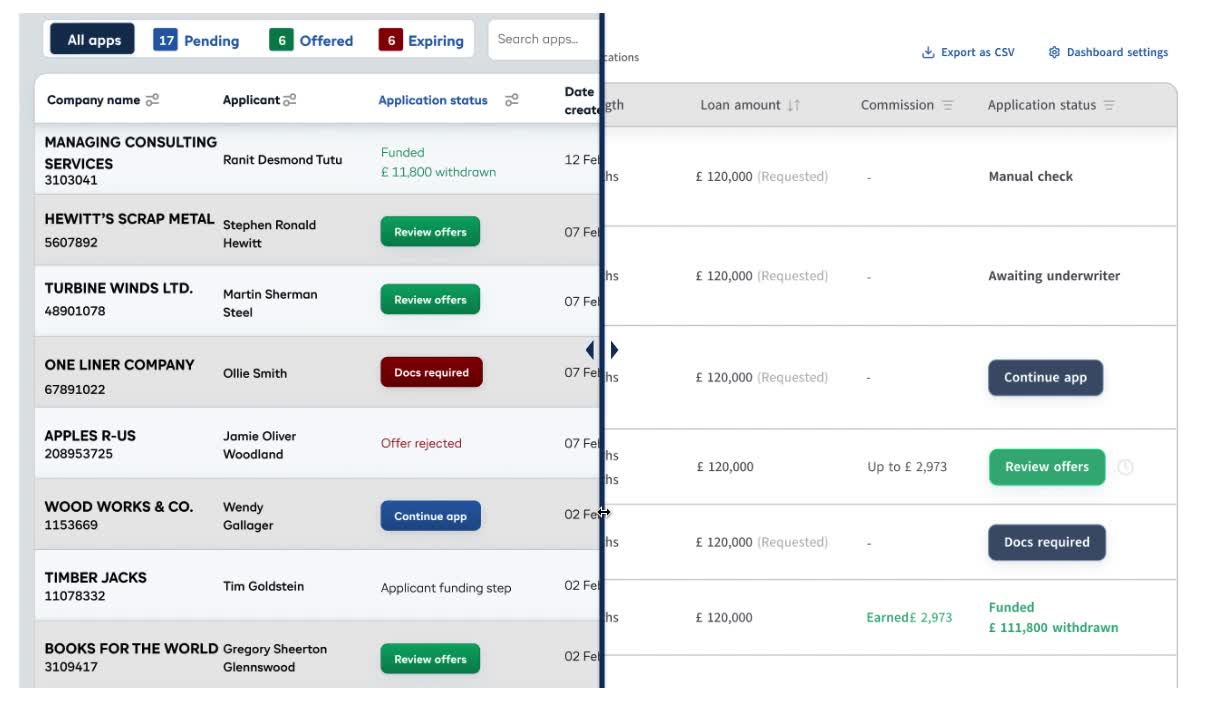
I led the redesign of a versatile introducer(broker) portal, restructuring the signup flow and increasing the conversion rate by 16.3%, while driving over 20.3% growth in new users. The product became the company’s largest funding stream and broke its highest revenue record in 2024.
Bounce rate
vs. Last year
12.02%
Conversion rate
vs. Last year
16.3%
Offered rate
vs. Last year
39.67%
New user growth
vs. Last year
20.03%

The Process

Discover
Surface the issue
What are the noticeable issues we can quickly identify?

The key conversion in the Portal occurs when brokers submit an application. I wanted to identify which steps cause the most drop-off and where brokers hesitate to complete the signup flow. According to the tracking system, we found:

1. High bounce rate on document upload page.
2. Recurring missing details in submitted applications.
3. Long waiting times without clear explanations.
4. Back-and-forth document review.
5. Users struggle to locate the application immediately.
Define
Break it down in detail
Once we found the main issue, let's find out what are the hidden problems.

Reach out to the real user

To better understand the issue, I took the initiative to conduct a face-to-face interview with the largest broker agency that has been using the portal extensively.

Identify shared user struggles

To avoid personal bias, I asked the team to map out the user journey and list any frustrations they could identify. Once the issues were gathered, we quickly grouped them into different scenarios and product sections, allowing us to translate them into practical improvements.
Imagine

Team alignment & in-depth discussion

We've noticed problems—now let’s explore the possibilities.

Blue-sky it

To explore as many ideas as possible for the core page—such as document upload—our team brainstormed together and bounced ideas off each other.

Feasibility check

Once we prioritised the features we wanted to build, we held a meeting with the development team to assess the potential cost of each feature

Stakeholders' needs & requirements

I suggested that our team discuss with the Broker Relationship Manager, as they best understand the brokers’ day-to-day work.
During the discussion, I used a USP matrix to help the team prioritise the importance of each feature.

Re-define our product's value

Except for the core features we're planning to implement, we had a meeting to determine what feature can ignite users' motivation and keep them sticking to it.

Other resources to gain insights

The team sends out bi-weekly surveys on a regular basis and consistently checks in for immediate support through internal group chats. We also monitor user behaviours using tracking platforms such as Amplitude and FullStory. Altogether, collecting this information has helped me identify both minor and major hurdles from the user's perspective.

Analyse

Market Research & Competitive Alignment

When exploring new features or product adjustments, I proactively conduct competitive analysis on lending proposition tools in the market. Through user interviews with broker teams, I discovered that an individual broker often uses multiple platforms simultaneously to secure the best offer for their clients.

This insight informed my design approach: aligning structural patterns and interaction flows with industry norms to reduce the learning curve and improve cross-platform usability. By designing with familiarity in mind, we were able to boost efficiency and user confidence for brokers navigating between tools.

Benchmarking three powerful lending products in the UK.
Design

Standerdise Information architecture

After several discussions with both internal stakeholders and external users, we reached a clear consensus: brokers prioritise speed. This insight led us to revamp the signup format as our first area of improvement. Before diving into the design process, I mapped out the existing user flows and created wireframes to standardise the architecture and streamline the journey.

Key improvements

Based on the agreed structure, I created an interactive high-fidelity prototype to test usability and feasibility internally before moving into implementation.
Minimise manual errors

Human make mistakes, such as typos or misreading information. I proposed a criteria-matching system. Users can select applicants directly from a pre-populated director list sourced from Companies House. With real-time validation messages, users are instantly notified if an applicant meets the criteria, enabling them to make quick corrections when needed.

Single page form

User research showed that most brokers are highly efficient when completing loan applications. As a result, we decided against using progressive disclosure and instead consolidated the multi-step form into a single-page format, streamlining the process without adding unnecessary friction.

Other improvements...
1. Integrated auto-input and clearer document requirements.
2. Improved UI with step indicators, filters, and dashboards.
3. Launched new features like a loan calculator and notification center.
Revision

Results & Testomonial

Since launching the new version of the portal in July 2023, we’ve consistently received positive feedback on the improved user experience and how the platform streamlines brokers’ workflows. The team continues to actively monitor product performance, and several new features are currently in the pipeline for future releases.

Source: Trustpilot
Screenshoted created: 5/5/2025