Time
Nov 2020
-
Jun 2021
Team

Tiffany

Zheng-Xiang Ke

Yunjen Liao

Kuan-Chen Chien
Role
UIUX, User Research, Usability Testing

Hikingbook is an mobile app and website that helps outdoor enthusiasts plan, navigate, and record their adventures.
Time
Nov 2020
Jun 2021
Team
Role
UIUX, User Research, Usability Testing


Before 2020, Hikingbook, a Taiwanese hiking app, faced navigation and interface issues. A six-month redesign improved usability with features like intuitive navigation and personalized trail recommendations, resulting in a 23% user growth and a boost in the App Store ranking.
I discovered that the previous team tended to address user needs from a single perspective, without considering the product as a whole during early-stage adjustments. As a result, many practical features were buried due to inappropriate placement and an ineffective hierarchy. This significantly hindered users' ability to achieve their goals efficiently.
Let's see some examples in my exploration:

Using complex icon without text may cause confusion.

A lack of classification led to too much information being shown at once.
Display the state with uncommon visual language.

Failed to vary the font size to prioritise the content.

It wasn't clear which one is the current view.

Segmented controls are typically used for switching between content, making them unsuitable for separating options like"Log In" and "Settings."
Consider using a more friendly TOV, which can make users feel more engaging and welcoming.

A complex task can be broken down into multiple small tasks to reduce cognitive load.

Features could be better explained in different plans.
And more...
Given the many flaws I identified, I decided to use usability metrics as a starting point to determine how to prioritise improvements and where to begin.
Effectiveness: As users operate a task, do they finish the flow with expectation?
Efficiency: How long does it take to let a user complete a task?
Satisfaction: After finishing the task, can user feel a sense of achievement?
As we understand, the primary purpose of using a hiking app is to ensure safety on the mountain. Therefore, we agreed to prioritise by the following order: Effectiveness > Efficiency > Satisfaction and further listing down what we want to achieve:
To gather more realistic feedback, I first searched for general feedback on various platforms, including the App Store, Hiking Biji, Facebook hiking groups, PTT, hikers' blog posts, and more. The majority of the issues revolve around the high learning curve when getting started, primarily due to the lack of organised components. When users don’t know what to do next, they struggle to understand the app’s functionality and eventually lose interest in exploring further.
Another issue I identified comes from the inclusion of uncommon features. At the time, most hiking products on the market focused primarily on offline maps and navigation. Only a few, including Hikingbook, offered a tracking feature, such as saving the paths you’ve hiked for future reference. Furthermore, Hikingbook included a feature to "synchronise" data from a local device to a database, which was unfamiliar to general users. The challenge for us is not only how to explain this feature clearly but also how to present it in a way that avoids making it seem complicated or intimidating to users.
Adding annotations for obscure states is helpful, but I noticed the previous team wasn’t cautious about the timing of these messages. They were often sent either in the middle of a key task, too early, or too late. While the initial intention was good, the poor timing ended up making the situation worse. Users became more confused and annoyed.

iOS | Paid app NT$220 (£5.3)

Android | Paid app NT$260 (£6.5)

iOS, Android | Free app

iOS, Android | Free app | Premium NT$1300 (£31.89) / year

iOS, Android | Free app | Premium NT$665 (£16.21) / year

I approached hikers who were nearby during my hikes and asked them which tools they used for hiking and why. After speaking with about eight hikers, I found that half of them used the Hikingbook app, while the other half did not. I then asked those who used the app about the challenges they had encountered while using it and what problems they hoped these tools could solve.
Hikers often join online hiking groups to access real-time information from others. I distributed a survey in these communities to learn which tools they used and what pain points they felt remained unresolved.
I initiated a brainstorming session where every colleague was encouraged to contribute ideas. This practice helped the team refine and enhance the specifications for what we considered the core features. If multiple team members agreed on a particular idea, we prioritised strengthening it during the improvement process. This collaborative approach allowed us to distil scrappy and intangible ideas into actionable next steps.


By observing and analysing competitors and gaining deep insights from real users, we identified several common features offered across these apps, such as offline maps and route tracking. These features appeared to be essential, leading us to conclude that they should always be easy to access.
We also discovered that users prefer tools that are lightweight and straightforward to operate. This is particularly important for hikers, who often carry heavy backpacks and numerous belongings. Given that most mountains in Taiwan are steep and feature rough terrain, hikers are generally unwilling to spend significant effort on detailed operations or navigate through a series of steps while walking.
After converging the ideas and improving the product, I first created a low-fidelity prototype for pilot testing within the team. After collecting raw feedback, I refined the prototype into a high-fidelity version. I then designed a series of tasks for testers to complete.
We invited five participants, including both new and experienced users, to complete a usability test. We observed about how quick they complete the tasks and when will tey stuck in the app. The results also showed that behaviors of these two groups differed significantly based on their familiarity with the app. We collected the positive traction and identified the pain points they encountered and categorized them into several levels of needs.

After the usability testing, I asked each participant to complete the System Usability Scale (SUS). A SUS score above 68 is considered above the standard. The testing outcome was 76, which exceeded the average. This result indicated that the iteration of the version was effective and better aligned with users' needs.

After collecting all the information from the usability testing, we categorised the problems by assigning various weights and prioritised them based on their frequency. This approach allowed us to quantify the issues and better understand how users interact with the product.


Replaced 'start' icon with an intuitive icon. Avoid displaying too many redundant elements; focus on showcasing the main features instead. Secondary features are placed on a separate level. Additionally, more information is presented on a full-screen map, allowing hikers to browse the route at a glance.

A lack of clear hierarchy among components causes users to lose focus and makes it unclear where to act.
Reinforce the weight of the title of the waypoint. Strengthen the clarity by applying various font sizes and colours to distinguish sections.

Users could only view two posts at a time, and the information displayed on the first level wasn't engaging enough to encourage interaction.
Displaying two posts side-by-side efficiently utilises screen space while highlighting the essential information that hikers care about.
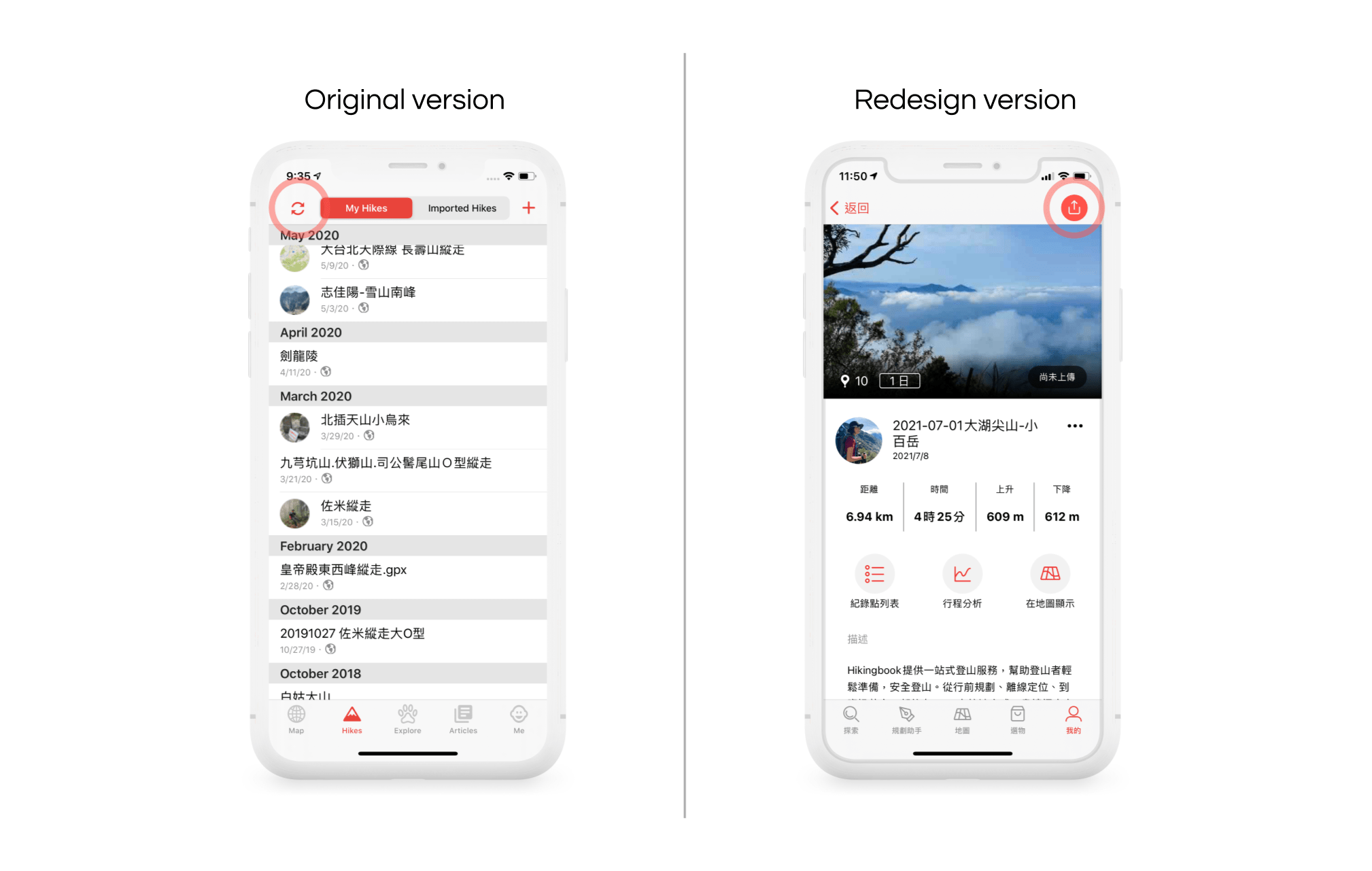
Users had to upload all hikes at once, which often led to lagging and occasionally caused the system to crash.
Replaced the 'sync' icon with an 'upload' icon to prevent misunderstanding. Users can now upload a single hike at a time, with a loading progress indicator added to enhance clarity.

Instead of using tabs switching the view, we listed down all fields in one view so user can easy to tell which field they want to edit.

Displaying all fields without proper organisation made users feel overwhelmed while filling them out.
Highlighted the important fields and de-emphasised the secondary information.

Different statuses were indicated solely by changing the text colour, which often caused confusion according to user feedback.
An 'eye' icon was added next to the text to clarify its meaning. When the status changes, both the color and the icon change to enhance clarity.

When users open the app for the first time, the onboarding pages briefly explain what the app can do for them. I designed a series of playful graphics to enhance engagement.

We added a pre-permission dialogue that explains why we wish user can allow us to use their location data.

When users first enter the app, they are guided through specific practice flows. We provide them with hints on how to use certain features.

After completing the sign-up process in the app, users are asked brief questions to help us better understand them. This information enables us to tailor messages more effectively for the target audience in the future.

In the new version, users can start tracking and easily add a waypoint with convenient access.

With the new style of view, users can now clearly see which route is being displayed.

Users can quickly jump to the previous or next waypoint within the same view.
After testing, I realised that optimising products isn’t just a straightforward path to a final destination. Instead, we should focus on continuously observing user behavior and empathising with their needs. At the same time, the product team must maintain high-quality standards to deliver a product that truly resonates with the market.
From identifying problems to researching users, brainstorming solutions, conducting tests, and making necessary adjustments, the project took about six months to complete. Leading the development team through such an extended process required patience and persistence.
Disagreements often arose during meetings, but I encouraged my colleagues to express their ideas thoughtfully and systematically. This open dialogue helped us reach a consensus and explore diverse perspectives, sharpening our solutions. Challenges, when approached with curiosity and attention to detail, often turned into opportunities for growth.
Transparent communication is crucial for effective collaboration. It helps prevent misunderstandings and ensures a smooth design process.
Careful planning and timeline management are essential for success. While flexibility is sometimes necessary, the team must stay aligned and on schedule. Balancing quality with deadlines is key to maintaining efficiency.
At times, I worried about the common belief that users resist change. However, the overwhelmingly positive feedback after the redesign proved that users welcome changes that help them adapt and grow in their environment.
In a constantly evolving world, standing still is not an option—even after achieving success. With technology advancing rapidly, there’s always room to create groundbreaking products by leveraging innovation and creativity.
