Time
October 30, 2022
-
May 25, 2023
Team

Tiffany

Frank C

Alice Chien

Ted
Role
User research, User flow, Market analysis, Rapid prototyping

Patent-pending AR technology to offer you instant meal portion control.
Time
October 30, 2022
May 25, 2023
Team
Role
User research, User flow, Market analysis, Rapid prototyping


Unlike apps that rely on dull calorie counting, FeastByFist introduces an intuitive approach: portion control by fists. Users can enjoy their favourite foods mindfully, stay within 12 fists a day, and develop sustainable habits while savouring every bite.
However, the product faced a challenge in conveying this concept, as many people didn't see any benefit from switching to this new product.
An app that keeps users motivated and on track.
Effortless, precise tracking with joy.
Aligned with the brand's theme, The Feast. We've introduced MFA login options, eliminating the need to enter a username and password each time.


Neutral colour mark "Regular Meals," while vibrant yellow highlights "Guilty Pleasures." Rather than harsh warnings, we emphasise what foods brings joy to them.

A clear, structured menu guides users effortlessly.
Users can track fullness and mood changes, inspiring future meals.


Simplified camera interface for easy portion sizing, with AR tech for enhanced accuracy.
Fulfilment drives motivation. Track daily meal consistency to stay on course toward long-term goals.


A photo gallery that not only showcases appetisers but also lets users order based on 'fullness,' aligning with food control goals.
I first reviewed the user flow of the current product. Despite having few screens, I quickly noticed usability challenges caused by an unintuitive structure and inconsistencies.


Most apps rely on calorie counting for portion control, which can feel tedious and demotivating. This fresh approach simplifies the process, replacing numbers with an intuitive, engaging way to manage portions.

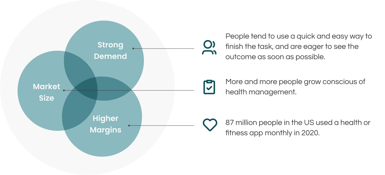
Understanding the business value of the app was essential. I held several meetings with the client, focusing on achievable goals. By asking questions about core values and market analysis, I gained a clear business perspective, aligning my work with their goals. I identified their unique advantages, defined the target audience, and used a specific market benchmark for guidance.
Potential Market
According to the World Population Review's Obesity Rates by Country 2022, the U.S. has an obesity rate of 36.2%, ranking 14th globally. This highlights a need for a simpler, more accessible approach to healthy eating, free from the constraints of calorie counting.
Value
A straightforward solution for efficient diet control, designed for everyday use.
Main Audience
Individuals in the U.S. struggling with obesity and seeking to improve their health.
Advantages
Simple to use, with precise calculations.
To gain deeper insights from real users, I conducted three contextual inquiries, each taking place in the comfort of the participant's home. Two participants were office workers, and the third was a postgraduate student from SoU.
This approach allowed me to observe users' real-time behaviours in their natural environment, helping them feel at ease and express themselves authentically. Without imposing predefined scenarios or tasks, participants freely interacted with the product, following their own paths. This provided genuine, unfiltered insights into how they naturally engage with the product.

Automatically count calories by taking food photos.

Tracks diet and exercise.


After identifying the necessary solutions, I redesigned the app’s page structure. The original design had "Settings" in the tab bar, which distracted users from exploring key features. Additionally, "Profile" was only accessible from the dashboard, limiting user access. To improve this, I rearranged the tab bar and added a profile shortcut on every page, allowing users easy access anytime.


At this stage, I focused on a broad user base rather than a specific audience, targeting people already familiar with other diet apps. The main challenge was how to encourage them to switch from their current tool to this new one.

After laying the groundwork for the project, I began creating the app's skeletons and flow. By presenting these visuals to my client, they gained a clearer understanding of the concept.

This project was conducted online. I advised my client that all team members should attend bi-weekly meetings to ensure smooth progress and minimise gaps. Despite being in different time zones, we managed to stay aligned throughout the development process. However, communication was limited to video meetings, which occasionally led to minor misinterpretations. Compared to on-site projects, this required additional patience and time to clarify issues effectively.

After signup, we share relevant insights about the upcoming plan. Our quick, engaging intro encourages balance: enjoy your snacks guilt-free while keeping to the 12-fists-a-day guideline.
First-time users are gently guided with soft markers, showing them what to do next."
The camera and save interface have been simplified for lightweight, hassle-free style for everyday usage.
Health isn’t just about body weight. We make it easy for users to track their waist measurements effortlessly.
Expand the time range to help users focus on long-term goals.
Instead of interrupting users during their meal, we send a gentle reminder to complete the remaining questions later.
The food gallery isn’t just for inspiration—it lets users sort meals by fullness and mood to find the perfect dish for their vibe.